Read time: 3 mins

Logos. They’re one of the most effective ways to communicate the message of your brand, and they have evolved massively over the years. Unlike other graphic design elements, logos are much more simplistic than they were 20 years ago – but interestingly there has been a re-emergence of 90s style logos lately.
With current and past styles now converging, what better time could there be to look back at the biggest logo trends of the last two decades?
Just after the turn of the millennium, logo design went through a huge change with the emergence of Web 2.0. The term itself refers to the change in how websites were developed and the tech that they used, but the phrase became used to sum up a distinctive change in logo trends, too. Before long, rounded letters, bright colours and multiple gradients were everywhere.
Crest logos were hugely popular by the mid-2000s. These kinds of emblems added an air of history and prestige to a brand, even if the company itself was new. The combination of medieval imagery (such as coats of arms) with modern and novelty elements was one that really caught on with customers, and crest logos became especially prominent in the sports industry.
Intricate lettering style logos have been a consistent favourite over the years, with advancing technology enabling designers to deliver more polished results. Although it has lost ground to more minimalist trends in recent times, lettering is still being used by companies like cafes and barbers, with the complexity of the calligraphy helping to create a craftsmanship-driven image.
Illustration logos have fallen in and out of favour as trends have fluctuated from detailed designs to minimalist concepts over the years – but right now, they are bigger and bolder than ever. Logos with a hand-drawn element have a big visual impact, and will help a company to stand out from the crowd. Commonly used for children’s products, illustration-based logos are enjoying a wide application, and there’s no sign of them going out of fashion any time soon!
Negative space hardly needs an introduction – but it’s particularly interesting as it is essentially a trend within a trend. There has been a shift from logomarks to logotypes, and we now often see text logos with shapes and images hidden inside the letters.
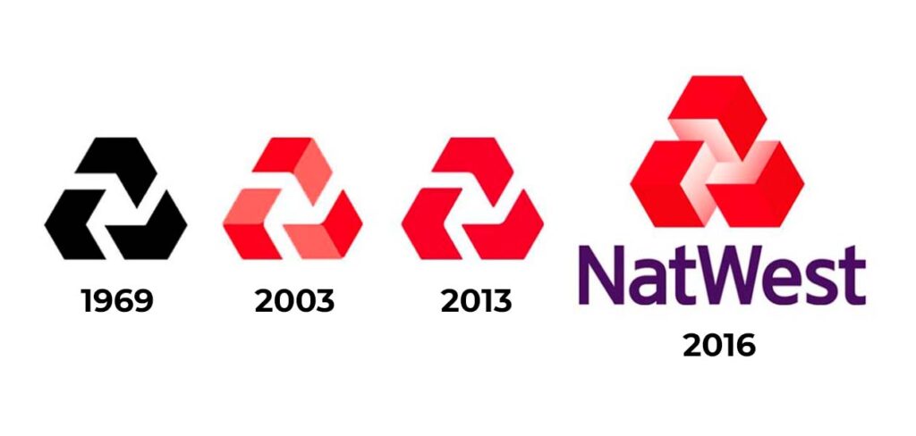
We’ve come full circle when it comes to flat design. Web 2.0 logos featured lots of gradients, shadows and reflections. Flat design is the antithesis of that. Block colours and minimal designs are in, and logos have taken on a much more streamlined look. This has made them much easier to view on mobile devices. Google’s logo is one of the best examples from the shift of Web 2.0 to flat design.
Fashion is fickle – as we all know – and there have been many logo trends from the last 20 years that we’re not likely to revisit any time soon. On the other hand, some techniques have stood the test of time.
Clearly then, trends and logo design processes have changed considerably in a period of rapid advancement. Looking at the historical development of a long-standing company’s logo will give you an insight into the various phases that the design industry has been through. We’ve mentioned Google already, but if you’d like to see the evolution of logo design in action, take a look at these great case studies from enduring drinks brands Coca Cola and Pepsi!